
In this activity students will explore temperature datasets. Some of the datasets are derived from observations, others use data generated by models, and some include data from models and observations.
In Activity III, students used observations to build a simple model, generated data using their model, and compared/validated their model-generated data with further observations. In this activity, students will continue to explore the difference between data from observations and data from models, using temperature.
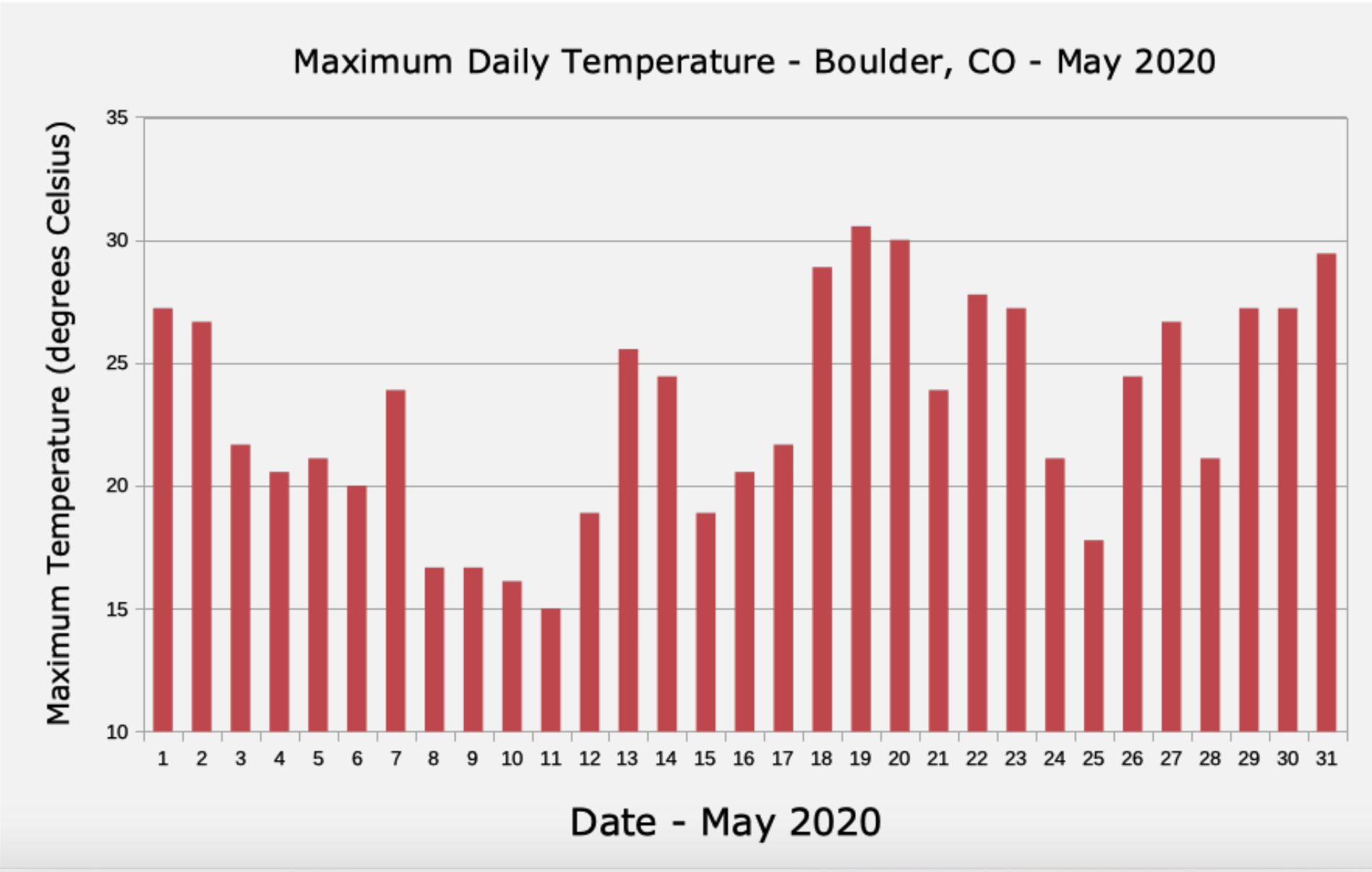
Show your students Figure 4, a graph of daily high temperatures in Boulder, Colorado for the month of May 2020. Ask them whether they think the data comes from observations or was generated by a model. Have your students explain the reasoning behind their choice.

Figure 4: Daily High Temperatures - Boulder, CO - May 2020
NOTE: The temperatures in Figure 4 come from direct observations. A thermometer in the city of Boulder measured the temperature at frequent intervals, and the highest temperature each day in May was used to create this graph.
This and the following graph were created using NOAA’s Climate at a Glance data visualization tool (https://www.ncdc.noaa.gov/cag). Consider creating a graph to represent your own state or county’s, or have your students create their own graphs using this tool.
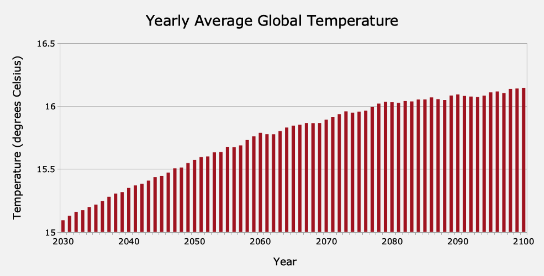
Next, show your students Figure 5, a graph of the yearly average global temperatures for 70 years. Again, ask your students whether they think this data comes from observations or a model, and have them explain their reasoning.

Figure 5: Yearly Average Global Temperatures for 70 Years (2030-2100)
NOTE: The temperatures in Figure 5 were generated by a model. The best clue that they are NOT from observations is the time scale. The graph shows temperatures from many years in the future, when we couldn’t possibly have actual observations yet. You may wish to remind your students that a common use of scientific models is to estimate or predict conditions in the future.
Some students might notice two other aspects of this data that hint that it might not be observations.
The values in Figure 5 represent the average temperature for a whole year, as contrasted with the values in Figure 4 which are actual daily readings. To create an average for a whole year, one must use some math and make some decisions about exactly how to calculate the average. The process of calculating an average is a type of modeling.
The temperatures in Figure 5 are an average for the whole globe, not a single location, as was the case for the readings from Boulder, Colorado in Figure 4. We don’t have weather stations with thermometers at every location on Earth, so deducing a value for global average temperature must involve some sort of estimates for temperatures in places between weather stations. This estimation process is another form of modeling.
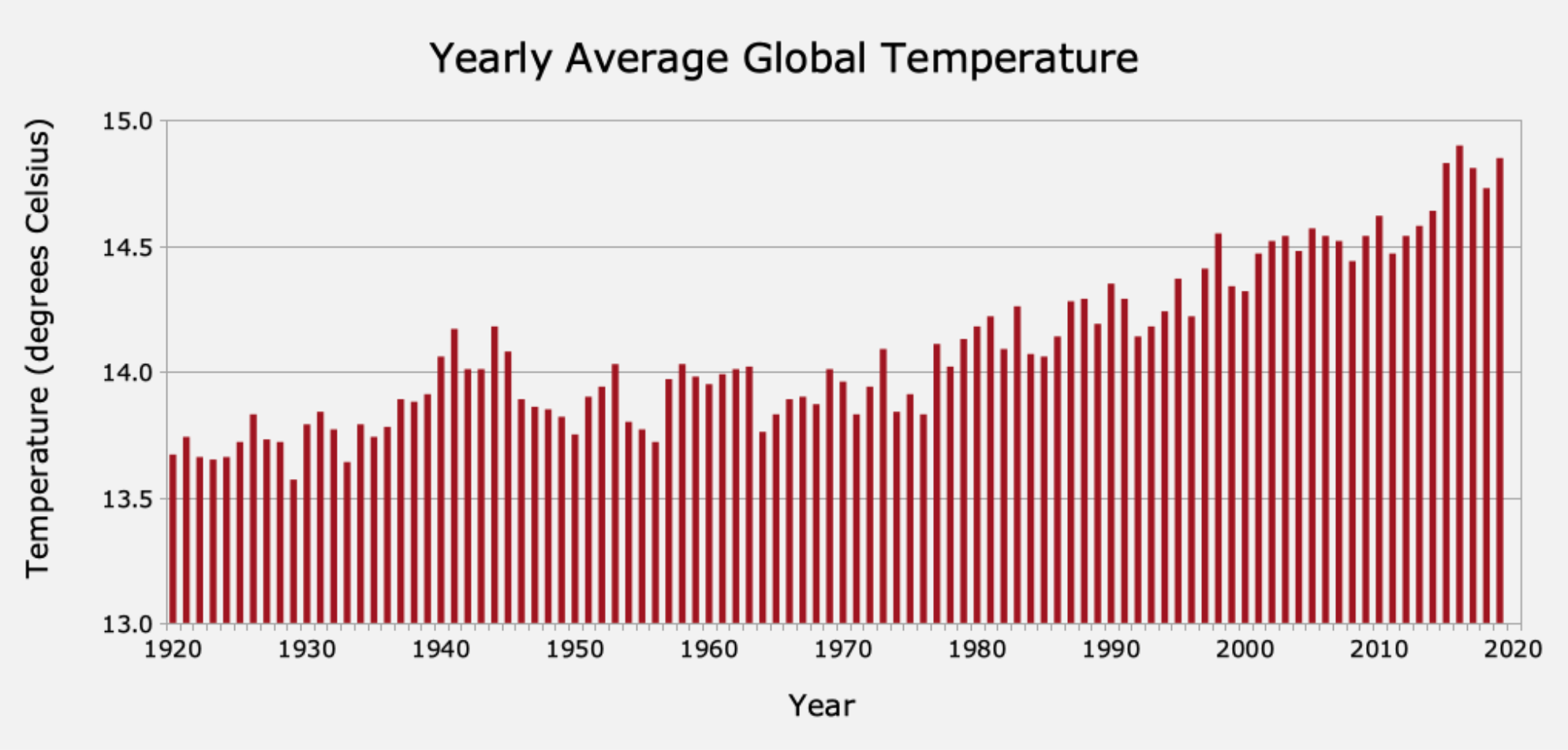
Next, show your students Figure 6, a graph of yearly average global temperatures spanning 100 years. Once again, ask your students whether the data for this graph comes from observations or a model. Have students explain their reasoning.

Figure 6: Yearly Average Global Temperatures for 100 Years
NOTE: This situation is less clear-cut. All of the data in Figure 6 is from the past, not the future, so students might presume it must be observational data. This dataset is derived from actual temperature observations from the past, so in that sense it is (at least partially) an observation-based dataset. However, as noted for Figure 5, the “observations” are actually averages over the entire globe and over the course of a year.
NOTE: Remind your students of the models they constructed for the temperature in Middleton - in Activity II, and for the location between Hawaiian islands - in Activity III. Lacking direct observations of temperature in Middleton or at location “X” between islands, they made a simple model to estimate the temperature in those locations. Similarly, scientists use models to estimate the temperatures at all of the places around the world where there are no weather stations. They combine values from models, which were based on observations, to estimate the average temperature for the whole Earth. The global average temperature is, therefore, derived from a model.
Likewise, the average annual temperature is also a modeled quantity. Many weather stations record temperature data only a few times each day. Scientists use models to estimate the temperature at times between measurements to fill in the gaps, and produce an average that covers 24 hours each day, 365 days a year.
Remind students that temperature data from the buoy in the Hawai’i example was recorded every 3 hours. If they wanted to estimate the temperature at another time, such as 10 AM, they would need to use a simple model.
Models are often used to fill in the gaps in datasets, between observations, with reasonable estimates. The gaps might be from places where observations are not available, at times when observations aren’t available, or both. This annual, global average temperature graph includes both.
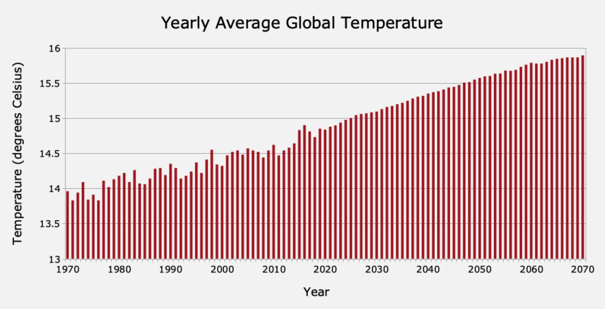
Finally, show your students Figure 7, a graph of global average yearly temperatures spanning a different 100-year period. Again, ask your students whether the data for this graph comes from observations or a model. Have them explain their reasoning.

Figure 7: Yearly Average Global Temperatures (1970-2070)
All of the data in this graph was created by a model. As was the case for Figure 5, some of the dates on this graph are in the future, so they cannot be from observations. Also, as in the case for Figure 6, the temperature data are global, yearly averages. That implies that a model was used to estimate temperature in between places and between times when observations were available.
NOTE: The modeled data from before 2020 is different from the data after that time. Until 2020, this dataset used actual temperature observations around the globe to estimate annual global values.
Although models were needed to fill in gaps to make a global average spanning each year, the values for the years through 2020 are more directly linked to actual observations than are values for later years.
After 2020, the data on the graph is generated completely from climate models. Although the climate models are built up from observations, the link to the observations is less direct. We simply don’t know any temperature data, anywhere on the globe, for the year 2060. Since the data up until 2020 is more directly tied to observations, we have more confidence in its accuracy.
Discussion: Scientists often produce graphs that combine data from past observations with predictions based entirely on models. Such graphs can help us see trends and how they might play out in the future. Sometimes it takes a keen eye, or a deeper dive into background information about a graph or dataset, to tell whether a graph is based on observations, models, or a mix of the two.