[
Students will “run” the predator-prey model created in the previous activity. Students will use the model to predict hare and lynx populations over a multi-year timespan. Students will create a graph of hare and lynx populations to better visualize the changing populations over time. Students will adjust some input values in the model to see how that affects the outcome.
NOTE: This activity description assumes you are having students run the spreadsheet model themselves. If you choose to demonstrate the spreadsheet in whole-class mode, adjust these procedures accordingly. If you choose to not build and manipulate the model with your class - in order to save time, skip ahead to the next activity in which the results of the model are analyzed.
Now that the predator-prey model is set up in a spreadsheet, have students “run” the model by filling in rows representing months of simulation time. We recommend running the simulation for 600 months of simulated time.
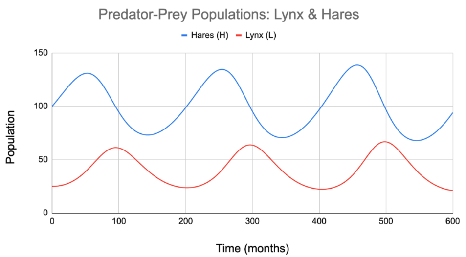
Ask students to graph the results, with time along the x-axis and lynx and hare populations along the y-axis. Details of producing such graphs will depend on the spreadsheet software your class is using (Creating a graph in Excel versus creating a graph in Google Sheets). Figure 2 shows an example population vs. time graph.
Discussion. Briefly discuss the main features of this graph.
NOTE: the next activity leads students through a more in-depth analysis of these results.
Guide the discussion so that students note the cyclical nature of the population levels, which rise and fall over the months. Students should notice that the “peaks” and “valleys” for the two population curves do not line up with each other, but are offset. Students should note the minimum and maximum values for each population. The hare population ranges from about 70 to 140, while the lynx population ranges from about 20 to 65.
Ask students to experiment with the model by changing some of the input values. They can change the starting populations of hares and/or lynx. They can alter the values of the three constants, k1 through k3, which control the birth and death rates for hares and lynx. Have students try small changes at first. They can raise or lower the starting hare population by 10 or 20, and the starting lynx population by 5 or 10. Likewise, suggest that students initially make small changes to the birth and death rate constants, such as changing k1 to 0.025 or to 0.015 from its current value of 0.02.
Ask students to describe the results of the changes they are making and if they are the expected results. What changes and what remains the same.
NOTE: As students make these small changes to the model, they should notice that the population graph changes with each new setting. However, for most such settings the overall pattern of the graph is the same: both population curves rise and fall in a repeating pattern, and the two curves have peaks and valleys that are offset from each other.
Students may want to see what happens to the model if they make larger changes to the starting populations or to the birth and death rate constants. Encourage students to experiment and explore. Large changes to the input values can “break” the model.
There are many combinations of settings that can kill off all of the hares or all of the lynx, or can cause either population to grow suddenly. One combination (starting with 100 hares and 40 lynx, and no changes to the constants) produces unchanging populations for both predator and prey. In that case, lynx births and lynx deaths precisely balance out, so the lynx population doesn’t change. Likewise, hare births and deaths are the same, so the hare population remains fixed. Remind students that not all results in models are expected to play out the same way in the real world.