Making and updating nautical charts is a continuous process that involves many people from different disciplines and organizations.
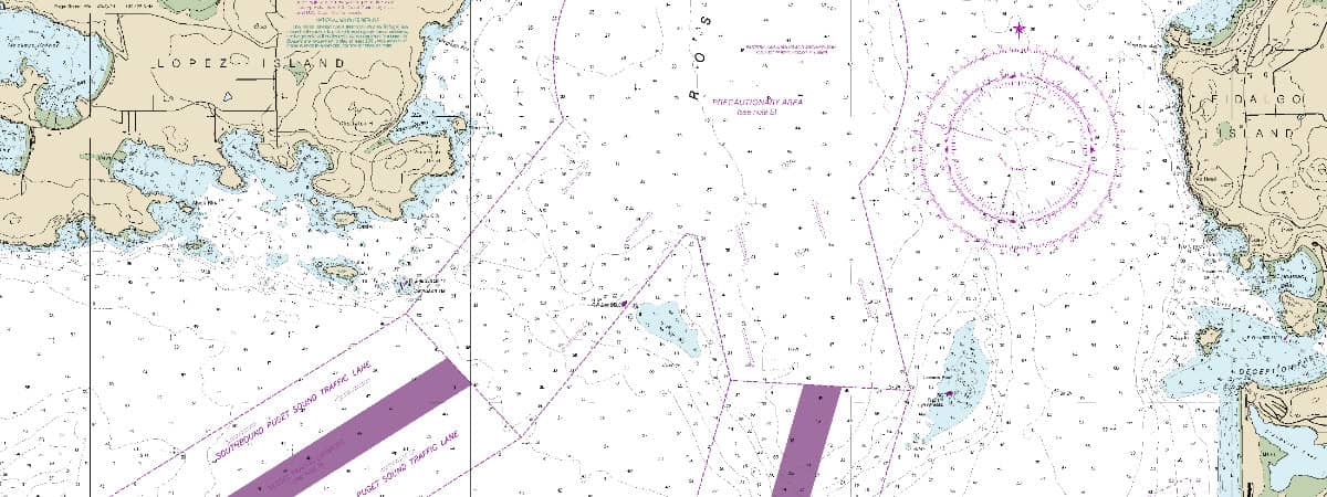
NOAA's Office of Coast Survey, part of the National Ocean Service, is the nation's nautical chartmaker. A nautical chart is one of the most fundamental tools available to the mariner. It is a map that depicts the configuration of the shoreline and seafloor. It provides water depths, locations of dangers to navigation, locations and characteristics of aids to navigation, anchorages, and other features. Shown here: part of Rosario Strait, Washington State.
A nautical chart is a map of the sea. Just as a map helps us navigate on land, a nautical chart helps those traveling on the ocean get where they’re going safely and efficiently.
In 2017, $1.6 trillion worth of goods moved through U.S. ports. With all that traffic, it’s important that those navigating through our ports and along our coastlines have the information they need about the shape of the shoreline and seafloor, water depths, potential hazards in the water, buoys, anchorages, and other features.
Federal laws say most commercial vessels must have nautical charts while traveling in U.S. waters. NOAA's Office of Coast Survey makes and updates all charts of U.S. coastal waters, the Great Lakes, and waters surrounding U.S. territories. So how do these important resources get made and updated? It’s a continuous process that involves many people from different disciplines and organizations.
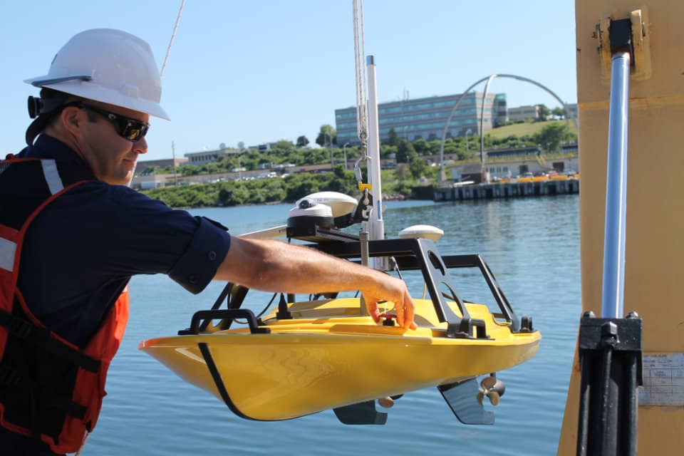
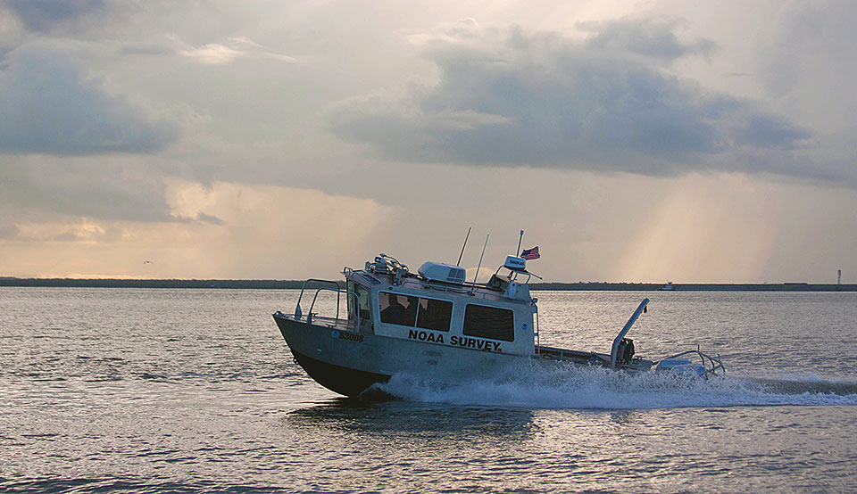
Lt. Joseph Carrier deploys a Z-Boat from the NOAA Ship Thomas Jefferson. The Z-Boat uses sonar to measure depths as shallow as one foot and can get that data into processing almost immediately. The boats can also get much closer to piers, pilings, and the shoreline.
Through sonar, LIDAR, and aerial photography, experts capture some of the data that goes into charts. That includes data about the shape of the coast and seafloor, depth of the water offshore, and features in the water that might hinder navigation.
With sonar, hydrographers bounce sound off the seafloor or underwater objects to determine their features like a dolphin using echolocation to “see” its surroundings. LIDAR works similarly, except it uses light instead of sound. Hydrographers use LIDAR to map features of the seafloor as well as the coast. Pilots also collect information about features of the coast from the air with aerial photography.
Often, humans operating instruments on ships and airplanes collect this data. But, increasingly, NOAA makes use of unmanned systems — robots that collect data where it might be expensive, dangerous, or otherwise impractical to send a human. Data collected with unmanned systems can be better quality, and it can be collected more safely, efficiently, and inexpensively.
Mapping it Out
Once we have the data, we have to turn it into a chart. This is not as straightforward a task as it might seem at first. The data we collect about the ocean and coasts describes a 3D world, but a chart is a 2D representation.
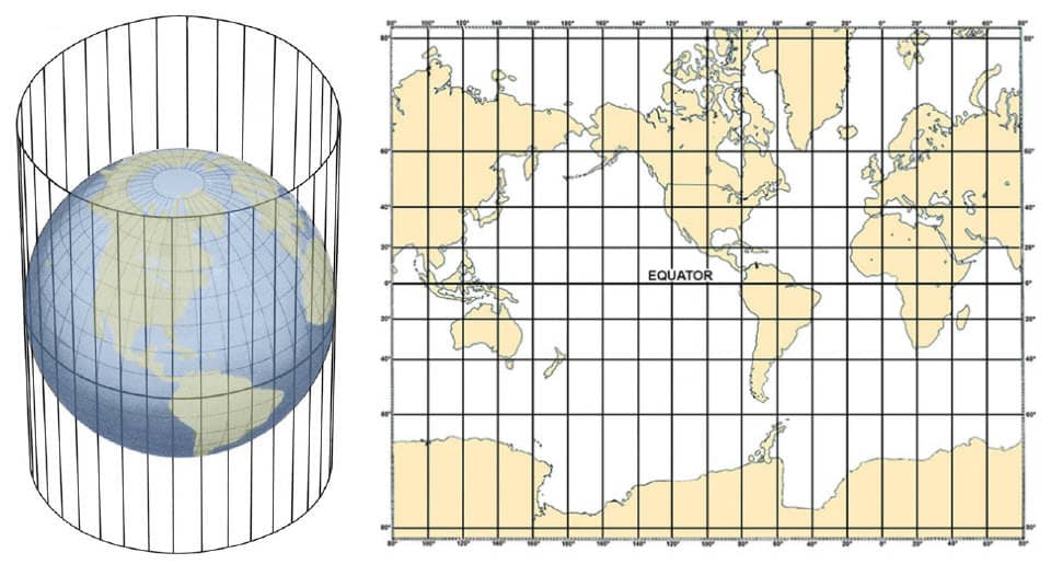
Making a flat chart of some section of our Earth requires making a projection. Imagine a spherical globe. Now, wrap a rectangular piece of paper around it, so it forms a cylinder. If there were a light shining from the center of our globe, the features on the globe would be projected onto our piece of paper. If we unroll the paper, we have a rectangular map. Map projections are actually created through mathematical calculation, but this is a way of imagining what happens when a map projection is created.
NOAA has a team of cartographers who are experts in interpreting data after it is collected. They are responsible for formatting, interpreting, controlling quality, and making sure that it is easy to understand as charts are made ready for use.
The Mercator projection is a cylindrical map projection. Imagine wrapping a piece of paper around a globe to form a cylinder. The map image is what’s projected from the 3D globe onto the 2D surface of the paper.
No map projection is a perfect picture of our world. Each projection method introduces its own distortions, so cartographers have to pick the right projection for the job. For charts, that's usually Mercator. Lines of latitude and longitude on the Mercator projection meet at right angles, and any constant compass heading can be drawn on a chart with a straight line. That’s why mariners have used Mercator charts since the 16th Century.
Sea Change
But the story doesn’t end there. Our ocean and coasts are always changing. Storms and other natural processes change harbor depths and the shape of coastlines. New channels, harbors, piers, wharves, marinas, pipelines, communications cables, bridges, or buoys get added. Recommended travel routes change. All of these updates have to be put on the charts.
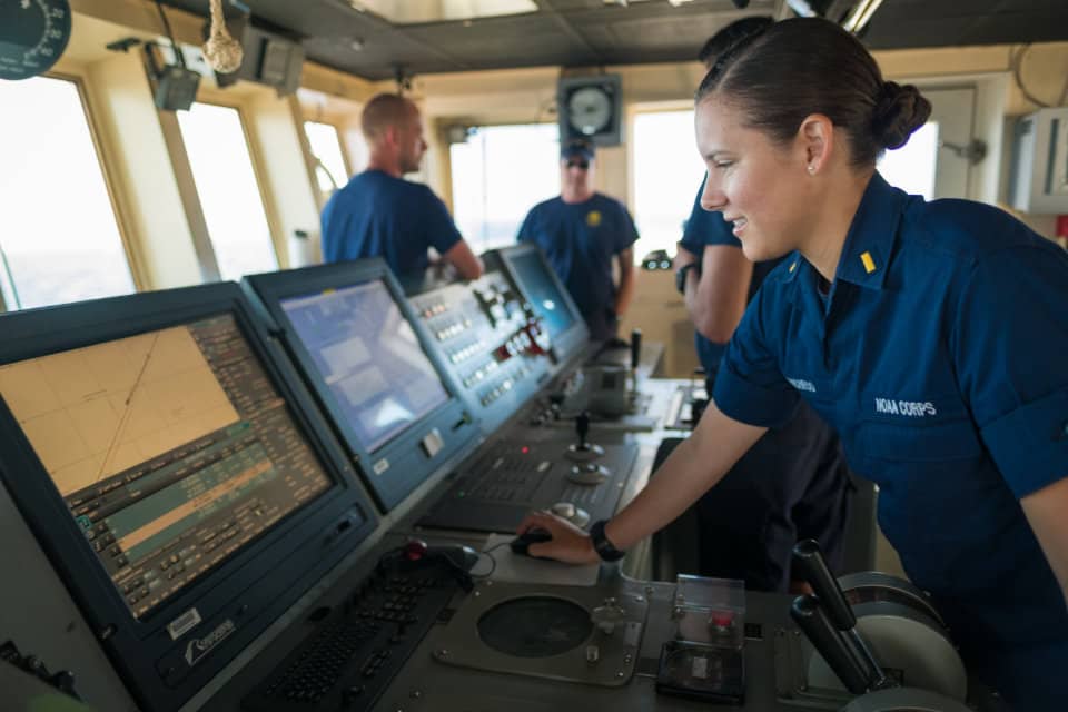
NOAA Corps Ensign Brianna Pacheco using the ship's Electronic Chart Display Information System to navigate the ship. ECDIS is a navigation app that includes electronic navigation charts and other tools.
And, of course, we’re always working to improve the quality of our charts. Many charts are based on data collected in the very early days of surveying, when data was collected with methods that are now outdated. These charts are accurate, but incomplete. With today’s technology, NOAA is working to complete and update charts for these underserved areas, such as Alaska and the Arctic.
NOAA's Office of Coast Survey navigation response teams collect new data in ports and harbors after infrastructure is built or the shoreline or seafloor changes. They take updated water depth measurements and check for underwater hazards. Six response teams around the country spend most of their time collecting data for chart updates, but are also prepared to respond after emergencies, such as severe weather.
 An official website of the United States government.
Social