A major update to a popular NOAA tool used to inform planning and decision-making in coastal communities is now online. Coastal County Snapshots, available on NOAA’s Digital Coast platform, turns complex data into easy-to-understand charts, graphics, and information. Users simply select an area of interest and the website does the rest — displaying an automated, easy-to-understand county-level analysis for a topic selected by the user. Snapshot topic areas are focused on issues important to any coastal community working to become more resilient to climate change — flooding, sea level rise, and economics.
A snapshot focused on coastal flooding is currently available, and one that shows counties where they are most vulnerable to climate change will be released in early 2022. Also available: two snapshots focused on economic vulnerability in relation to flooding and sea level rise. One provides data about county jobs and businesses, while the other focuses on economic sectors that depend on the coast, such as commercial fishing, tourism, and offshore mineral extraction.
“Communities use this data to understand their vulnerabilities and make informed planning and investment decisions at the county level,” said Nicole LeBoeuf, Assistant Administrator for NOAA’s National Ocean Service. “The snapshots combine data from different sources into an easy-to-understand format, which means all coastal communities now have equal access to the best available science about the potential risks they face, and the analysis that data can provide.”
Coastal County Snapshots data are delivered in two ways: as printable handouts and in digital form. The printable handouts have long been a favorite of local officials who want to help educate their citizens and leaders about local vulnerabilities.
Several upgrades improve the digital version with this new release. First, charts and graphics now include the ability to display data superimposed on a map. This helps pinpoint the location and extent of a county’s vulnerabilities. Second, county technical staff can now access all of the data used to create the snapshots, which allows them to use this information to inform local planning efforts.
NOAA is working on a fourth snapshot that covers sea level rise due out in early 2022, which will include up-to-date, long-term sea level rise projections.
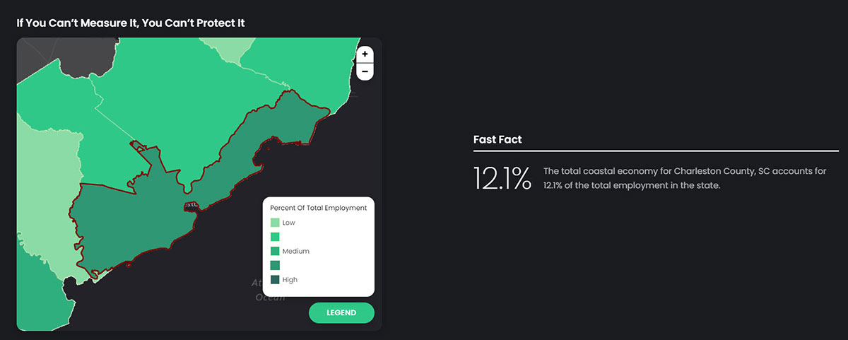
Sample Graphic: Total Coastal Economy
- This graphic is a sample of the type of "presentation ready" graphics delivered by Coastal County Snapshots for counties that border the ocean or Great Lakes around the nation.
- The title of the graphic is "If you can't measure it, you can't protect it." The background of the graphic is black, with white text and includes a map of Charleston, SC, counties in shades of green.
- On the left side of the graphic, a simplified map is shown in shades of green of counties surrounding and including Charleston, South Carolina. The area around Charleston, South Carolina, is bordered in red indicating it is selected.
- The green color of each county displayed on the map corresponds to a legend shown on the bottom left, which shows five different shades of green ordered from lightest to darkest. The legend box is titled, "Percent of Total Employment." Each county is shaded a different color of green, indicating employment density. The lightest shade of green islow percent of total employment, the darkest shade of green is the highest percent of employment. Charleston, South Carolina, is the darkest shade of green, indicating a high percentage of total employment.
- The right side of the graphic shows the following text. The title is "Fast Facts." Underneath this title, the graphic reads "12.1 percent: the total coastal economy of Charleston County, SC accounts for 12.1% of the total employment in the state. "
 An official website of the United States government.
Social